Date Module
The Date module can be used within a Form Section to ask Experience participants for a date input in a certain format.
You can edit the Date module in the Page Builder by clicking it, or by clicking on the Pencil icon.
The following sections are available which can be edited (from the tabs at the top): Settings, Design, Logic, Advanced.
Settings
On the Settings tab, you can configure:
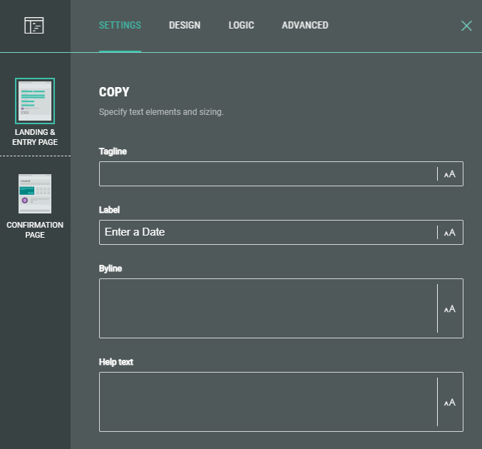
- Copy — Specify text content and apply styling for tagline, label, byline and help text.
- Required — Enable the toggle to make this a required field for the Experience participant to complete.
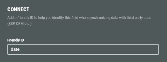
- Connect — You can add a Friendly ID to help you identify this field when synchronizing data with third party apps (ESP, CRM etc.)
- Format — Specify the order in which to format the date (month, day and year).
Note:
You can choose from these date formats: Day/Month, Month/Day, Month/Year, Year/Month, Year only, Day/Month/Year, Month/Day/Year.
Design
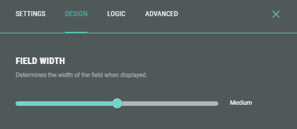
- On the Design tab, you can define the field width of the Date fields by dragging the slider to the left or right (check the preview window on the right to verify the desired field size).
Example: Here you see compact versus large field width.
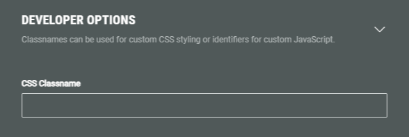
- Additionally, you can assign a CSS classname to the Date module for using custom CSS styling.
Warning: Using a custom CSS classname will overwrite the default styling.
Only use this when you're familiar with using CSS code.
Logic
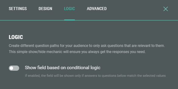
On the Logic tab, you can create different question paths for your audience to only ask questions that are relevant to them. This is based on conditional logic determined by answers given to quiz questions in this Experience.
Example: Only show the Date field when Option B was given as answer to the What are you interested in? question.
Advanced
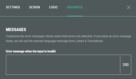
On the Advanced tab, you can customize the error message shown when a participants' input for the Date field is invalid.
Note: If you leave the error message blank, we will use the relevant language message from Labels & Translations.


